ClockPetals - A traffic analyzer
Click here to play with the system
Introduction
ClockPetals is an online visual analytics system designed for traffic analysis. This project was submitted to 2017 IEEE Visual Analytics for Science and Technology (VAST) Challenge Mini-Challenge One.

A bit about the VAST challenge: it’s an annual IEEE competition event aiming to advancing visual analytics idea, design, and techniques. It usually kicks off in late April and ends by mid July.
Each year VAST challenge provides meticulously synthesized dataset and context stories to the participants from all over the world and asks them to investigate what the data can tell via visual analytics methods, or how visual analytics can help solving problems. Typically every challenge consists of 2-3 sub challenges (called “mini-challenge”) and, maybe, a grand challenge when the mini challenges are connected or in the same context. The investigation result (solution) should answer 3-5 questions the challenge asks. For each question, the solution should presents about 5 visual evidence and explanation for supporting the patterns/anomalies the investigation finds.
In the summer of 2017 (also in 2016 but another story), I worked with two serial-player-and-awardee professors in VAST challenge, along with an undergrad developer, a data scientist PhD (remote),and three visual designers. We competed for two mini challenges in parallel. I was appointed as the team lead to
-
manage the design and development iteration. Normally we had 1-2 weekly meetings to report the progress and to discuss/critique the design ideas and their implementation. Since the projects were driven by the solution and the design, we started by exploring and massaging the data in the first couple of weeks. Meanwhile we brainstormed a lot of design ideas. When a design plan including features and visualization forms was determined in the meetings, I setup goals and deadlines for both design and development so that we could present the practical-but-mocked-up progress in the next meeting.
 (process flowmap courtesy by one of the designers Wenjie Wu)
 -
implement and code the design ideas for mini challenge one with the undergrad developer. I architected the tech stack, controlled the versions (I really should’ve used Git but the situation was complicated…), and suggested the code styles. The choice on JavaScript and D3.js over PHP increased the performance and development efficiency indeed.
-
oversee the progress of mini challenge two as we had quite a lot of ideation trials and the design iteration did not finalize until the last a couple of weeks. What I could do was to prioritize ClockPetals and then participate in every discussion for mini challenge two.
-
support the team also by organizing team lunch and activities such as canoeing and barbecues. Most team members were the first-time challenge participants. More importantly, they lacked experience of being involved into a serious large project driven by specific outcomes (The Award!). I made relatively rigorous daily schedules while fought with them from the beginning to the end in order to keep everything on the right track without a KPI or corporate rules (because sometimes nobody could/would fire anybody when they should in academic).
Okay, so much for the background and my team. Now let’s begin with the simplified version of the problem…
Problem Statement
Context
The problem: It’s a fiction. An ornithologist investigated the human activities’ impact to an endangered specie of bird in a fictional natural preserve park. He hypothetically related the decrease of the number of birds to 1) the air and noise pollution brought by the park traffic and 2) the campers’ (even poachers’) invasion. The ornithologist needed help to analyze the short and long term patterns and outliers of human life in the park through traffic sensor record in order to obtain the most impactful factors on the birds.
The data: The synthetic data came from the vehicle sensors installed at major visiting sites, road conjunctions, entrances, and gates in the park. Each vehicle that visited the park got assigned a unique car ID. A sensor recorded the car ID and the timestamp when the vehicle passed by the sensor. So, each vehicle passed by a sensor would generate a row of record in the dataset. The dataset contained 170,000+ entries over 13 months.
Data
-
A 200 x 200 bitmap
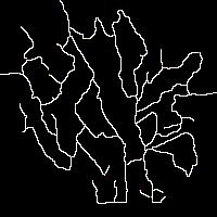 .
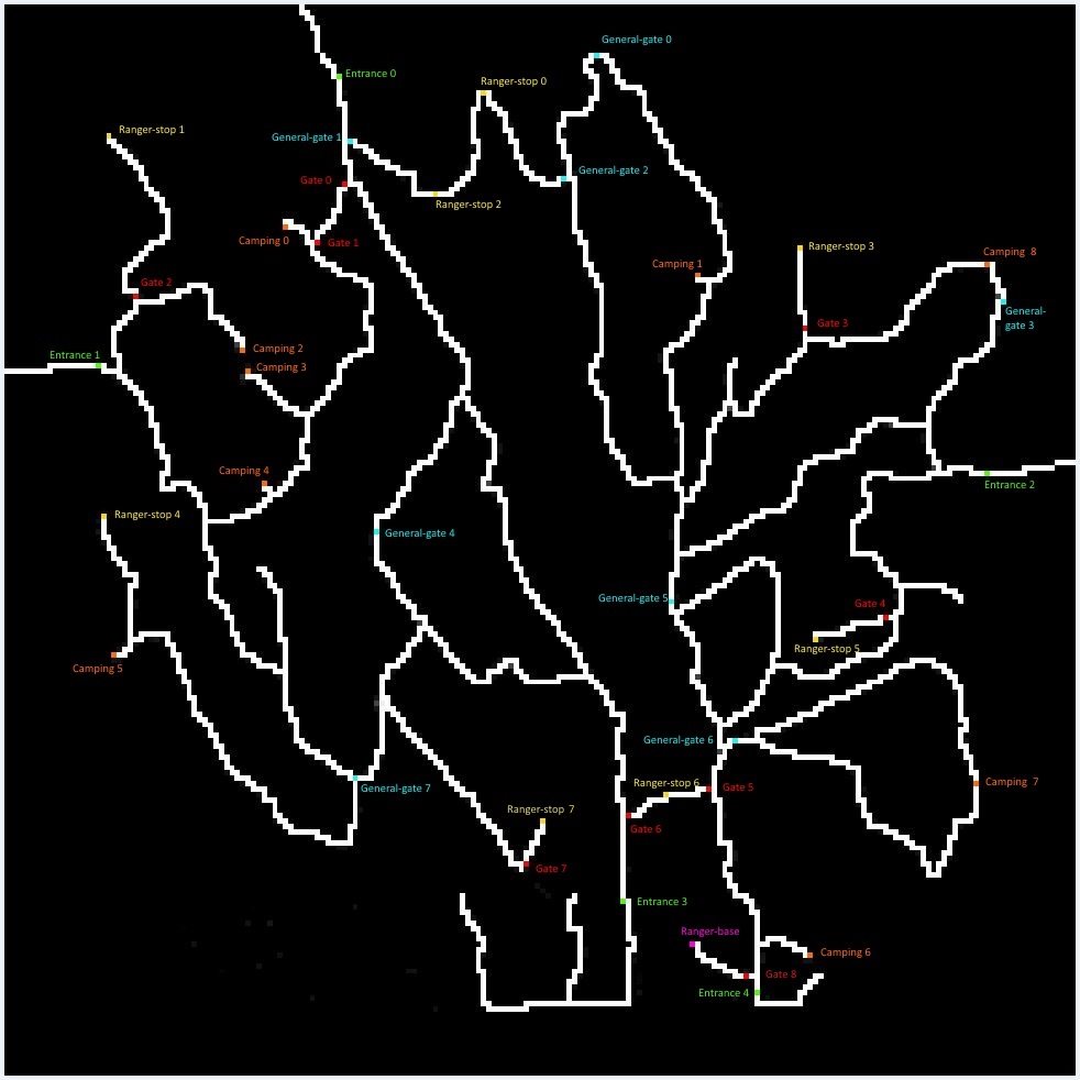
.White pixels for the roads and black pixels for the park land. All the sensor locations were tagged by pixel in colors and labeled accordingly. Map description can be found here.
-
Sensor data in CSV format.
Same vehicle entered the park multiple times maintained the car ID. There were seven types of vehicles in total. Data description can be found here.
timestamp car-id car-type gate-name 2015-05-01 00:15:13 20151501121513-39 2 entrance4 2015-05-01 00:32:47 20151501121513-39 2 entrance2 2015-05-01 01:12:42 20151201011242-330 5 entrance0 2015-05-01 01:14:22 20151201011242-330 5 general-gate1 2015-05-01 01:17:13 20151201011242-330 5 ranger-stop2 2015-05-01 01:20:36 20151201011242-330 5 ranger-stop0 2015-05-01 01:24:11 20151201011242-330 5 general-gate2 2015-05-01 01:46:16 20151201011242-330 5 entrance2 2015-05-01 01:55:25 20155501015525-264 1 entrance0 2015-05-01 01:56:53 20155501015525-264 1 general-gate1 2015-05-01 01:59:27 20155501015525-264 1 ranger-stop2
Data Preprocessing
- A Python module to process the bitmap park map to
- clean up the grey noises between the roads in white and lands in black.
- enlarge the map to facilitate analyzing the map.
![processed map]
- Imported the data to MySQL database and restructured to four tables.
-
A table with all records, adding index, total times of visit, and the temporal order of each visit.
id timestamp car-id car-type gate-name tdate ttime times sequence 1 2015-05-01 00:15:13 20151501121513-39 2 entrance4 2015-05-01 00:15:13 1 1 2 2015-05-01 00:32:47 20151501121513-39 2 entrance2 2015-05-01 00:32:47 1 2 3 2015-05-01 01:12:42 20151201011242-330 5 entrance0 2015-05-01 01:12:42 1 1 4 2015-05-01 01:14:22 20151201011242-330 5 general-gate1 2015-05-01 01:14:22 1 2 5 2015-05-01 01:17:13 20151201011242-330 5 ranger-stop2 2015-05-01 01:17:13 1 3 6 2015-05-01 01:20:36 20151201011242-330 5 ranger-stop0 2015-05-01 01:20:36 1 4 7 2015-05-01 01:24:11 20151201011242-330 5 general-gate2 2015-05-01 01:24:11 1 5 8 2015-05-01 01:46:16 20151201011242-330 5 entrance2 2015-05-01 01:46:16 1 6 -
A table compressed the visits from the same vehicle, showing total number of records, earliest and latest record time, and total times of visit.
car-id car-type counts minTime maxTime times 20151501121513-39 2 2 2015-05-01 00:15:13 2015-05-01 00:32:47 1 20151201011242-330 5 6 2015-05-01 01:12:42 2015-05-01 01:46:16 1 -
A table with rows showing each visiting segment based on temporal order.
id carid stoptart stopend seconds starttime endtime sequence times cartype 1 20150001010009-284 entrance3 general-gate1 1244 2015-07-01 13:00:09 2015-07-01 13:20:53 1 1 3 2 20150001010009-284 general-gate1 ranger-stop2 159 2015-07-01 13:20:53 2015-07-01 13:23:32 2 1 3 3 20150001010009-284 ranger-stop2 ranger-stop0 184 2015-07-01 13:23:32 2015-07-01 13:26:36 3 1 3 -
A table specifically with rows indicating when (hour) the vehicle entered the camping sites and the ranger stations.
carid cartype tdate gatename hours 20150002070024-376 2 2015-06-02 camping0 07:00:00 20150003080058-668 3 2015-07-03 camping0 09:00:00 20150011070002-311 3 2015-07-11 camping0 07:00:00
-
Features
The design process including ideations and iterations can be found here or here. Below is some highlights.
- Map
-
Ideation
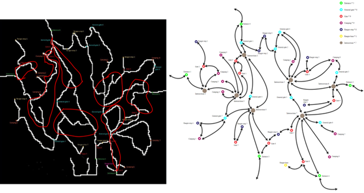
Given a map and time-sequential records, it’s a typical spatio-temporal visualization problem. However, the map has nothing to do with the real world, which means no map API is available. The provided map looks utterly unpleasant (believe me or not, there was team made visualization out of that black map image). Moreover, we did further investigation on the map and the data and found that some road information seemed redundant. For example, we don’t care much about if the vehicle took east bound or west bound to travel from location A to B. We also found major road conjunctions in the park, where the vehicles must pass by when their trip are across the park area. We came up an idea to revamp the map to make it more visually pleasant withholding necessary information. One of the visual designers did this in Adobe Illustrator so that we can have the pair (x, y) of the sensor of each site/gate.
Expressing a road that connects two sites is the next task. We wanted to distinguish the traffic direction (A to B or B to A) while maintaining the clarity. Google Map enables the traffic layer on each bounds of a road but one really needs to zoom in to tell the difference. We came up with an idea so please see iteration section.
-
Iteration
-
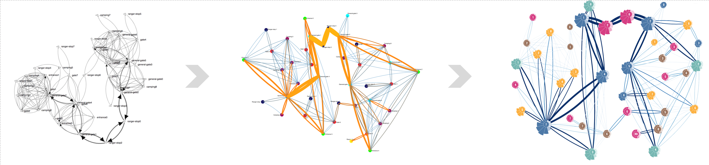
First, we attempted forced-directed graph without force as the nodes’ location should be fixed. The links between nodes represent two directions of the road by the arrows and their shades tell the traffic amount. The problem is the arrows overlapping with the node. A closer look,
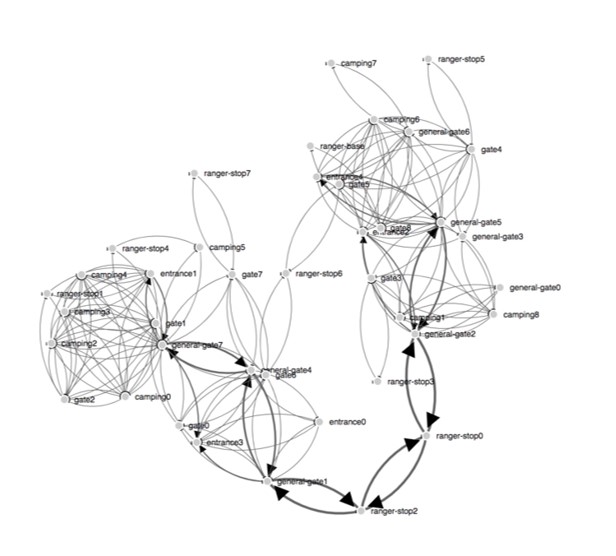
-
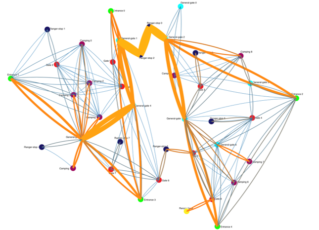
Then we updated the directed graph to geographic based map using curvature to indicate the traffic direction (assuming driving by the right). The position of the nodes, which are park sites, strictly follows the provided map. Color of the nodes indicates its type. The links, a.k.a the roads, are double coded by width and colors. However, the use of hues for amount are confusing and the links width are hard to differentiate.
-
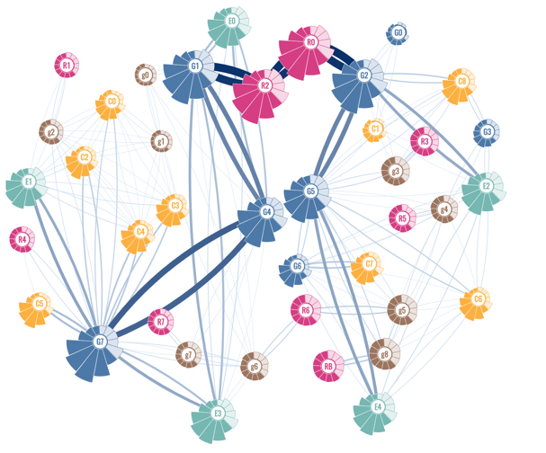
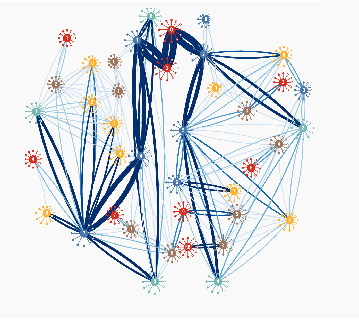
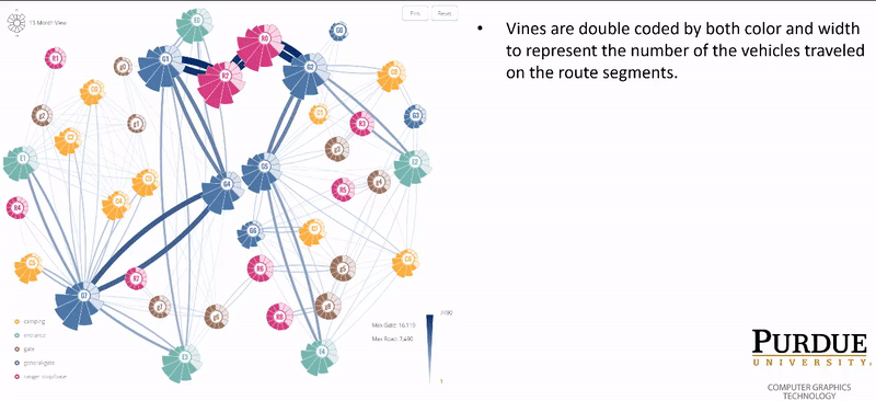
Finally we finalized the design with the map below. We redistributed the positions of the gates for aesthetics. After all the exact location of each site is compromisable. We carefully designed the color of the nodes and used only one color for the links with various brightness to tell the traffic. The meaning of the width of the links change dynamically based on the maximum local value in the current view.
-
-
- Node (a.k.a sites/gates)
-
Ideation
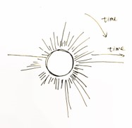
We wanted to have enough data visualized on the overview, namely the map. Then we can filter the parameters to the details. For each node, we had 13-month, and further, 30-day, and 24-hour data. An idea of flowers (node) on the vines (links/roads) came up. So we had some design…

-
Iteration
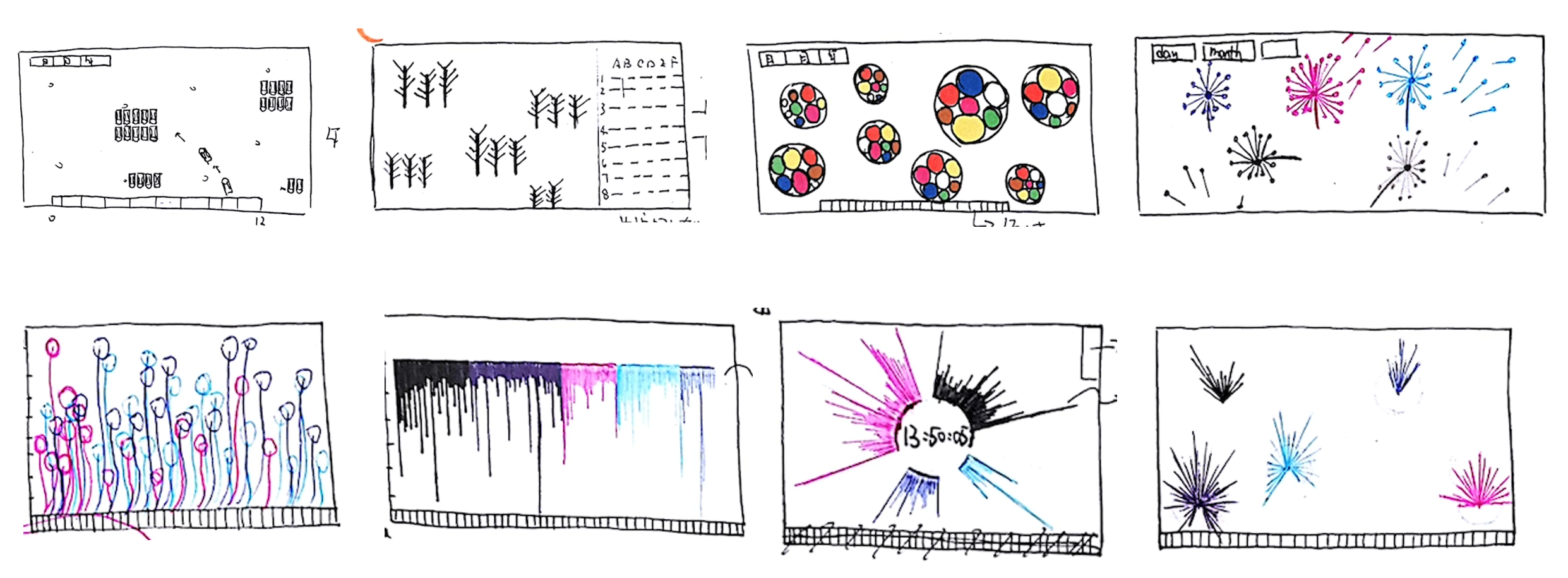
- We attempted to mock up circular area map, and circularly-arranged lines, bars, and polygons. Not only the node itself, but also with the links. The areas, and length of lines, bars, or polygons show the traffic in that month/day/hour.
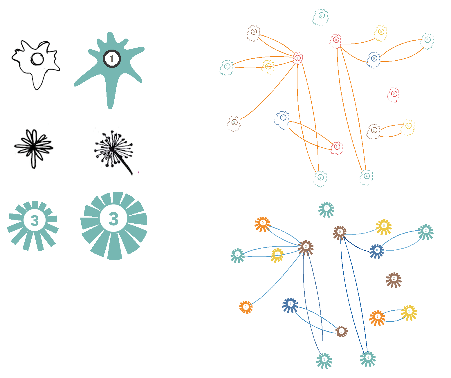
- We decided to give circular-arranged lines a try. We tried to use the length of the lines to represent the traffic amount, mimicking dandelion. But such an amount actually range from less than 10 to over 10,000. If applying same unit length, some line would be super long and some would be too short to see. The problem is obvious - applying an appropriate data transformation to make our nodes pretty. We had no luck.
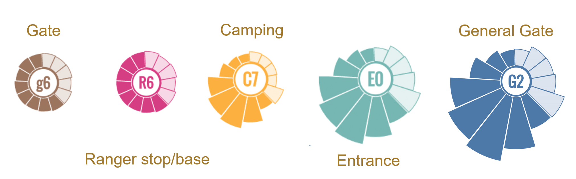
- We finalized the design to fun-shape petals. The data transformation makes much sense as the area of each fan represents the traffic amount so that the length of the radius of each fan just equals the square root the data. The colors are in harmony with each other and with the links. Color and text letter identify the sites. Especially when the given dataset ranges between Mays in two years, it’s very easy to compare the data longitudinally.
- We attempted to mock up circular area map, and circularly-arranged lines, bars, and polygons. Not only the node itself, but also with the links. The areas, and length of lines, bars, or polygons show the traffic in that month/day/hour.
-
-
Multi-dimensional filtering The traffic can be filtered by the type of the vehicles, the month they visited, and the road segment on their trip route. See the interaction section.
- Detail view (for camping sites and ranger stops)
-
Ideation
We wanted to plot every visitor of camping sites and ranger stops as we found they are the only places where the vehicles did not only pass by but also stayed. Our brilliant designers came up with amazing mockups…
-
Iteration
Same logic. Length of the lines/bars for the duration of the stay.
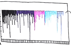
- Lines organized linearly. The drawback is the time axis would be very long to cover every hour in every day in every month. The team from University of Konstanz, Germany actually implemented this idea in their submission. They visualize the data on huge screen to get around the use of space and enable the clearness.
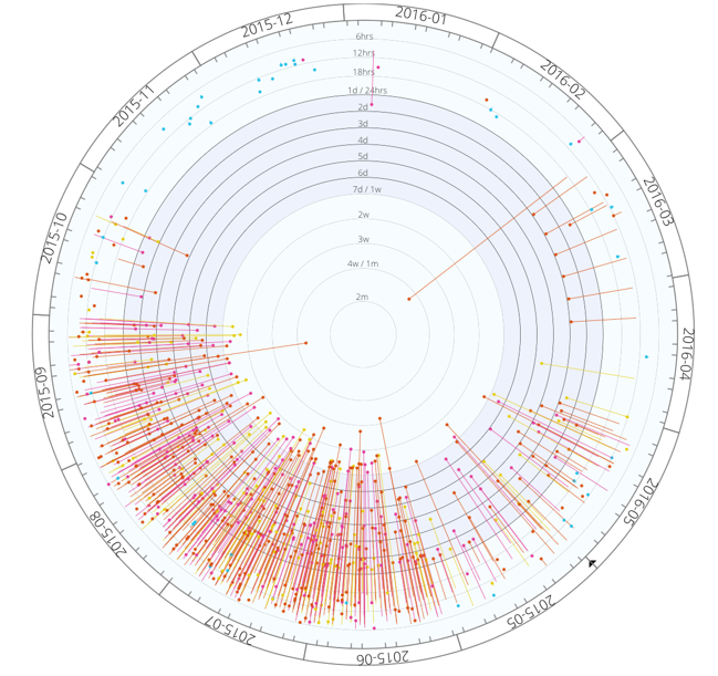
- Lines organized circularly. The direction of circumference is the month axis like the arrangement in overview (the node). The direction of radius is the duration of the stay. It’s getting closed to the final design…
- We finalized the design as below. All vehicles that visited this camping site or ranger stops are plotted. The longer the length of the “pin”, the longer this vehicle has stayed in the site. When it appears as dot, it means the stay is very short and needs to zoom in if needed. When it appears a line, it is read from outside towards center. The position of the starting end also indicates when (within a day) this vehicle entered the camping site. The ending end indicates the leaving time and provides an interactive hook to link this vehicle back to the map. The interaction designed on this view will be explained later.
- Lines organized linearly. The drawback is the time axis would be very long to cover every hour in every day in every month. The team from University of Konstanz, Germany actually implemented this idea in their submission. They visualize the data on huge screen to get around the use of space and enable the clearness.
-
- Interactive features
- Month and vehicle type filter from the left panel
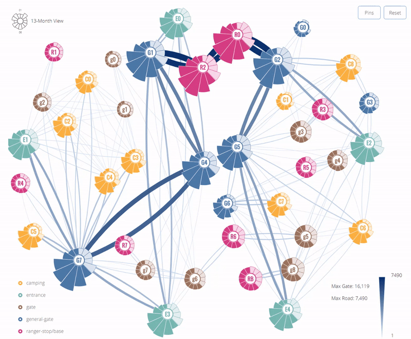
- Route filter - click on the road segment to filter the vehicles that have travelled on this route. Right click to remove them. The segments are double coded by color and width. The maximum width is the most traffic in the current filtered view. The change of brightness indicates how the values in the current view compares the global maximum.
-
Vehicles in detail view filtered by selecting certain entering time. Hover the “pin” to highlight all stays by the same vehicle. Click the small circle on one end to see its route on the map.

- Click the petal to see line graph showing the daily traffic trend.
Development
- Month and vehicle type filter from the left panel
The entire system runs on an Apache+Linux+MySQL server hosted at Purdue. For fetching the data, we scripted several JSON APIs using PHP and Python and accessed the APIs using d3.json(). Frontend, we used D3 V4 with extensions such as d3-scale-chromatic and d3-extended. The animation were mostly programmed using d3.transit(). We were not able to achieve vanilla as the vehicle type filtering rules are pretty complex so that we used jQuery. The overall JavaScript code is around 5,000 lines.
Findings
What happened/will happen next?
- I revisited the system almost a year after the competition. I refactored some code to enable the responsive layout for various computer screens.
- Bug fixes. For example, the hourly traffic line graph is still missing in 30-day view.
- The data gets transferred to the browser is still very large (dozens of MB). It’s okay after the first-time website visit as the data would be cached. But to improve the first-time visit, a couple of things are possible:
- use Promise to control when the data finishes transfer so that we can do some walk-through before it’s done.
- render the overview, which needs a lot of data, on the server and only transfer the rendered HTML.
License
This document is licensed under the Creative Commons Attribution Share Alike 4.0 International, and the underlying source code used to create this document is licensed under the MIT license.